
ankitagogne@gmail.com

Redesigning website and 0-1 dashboard experience
CASE STUDY
ROLE
UX -UI Designer
TIMELINE
3 Months
TEAM
1 Designer (me)
1 Senior Designer
SKILLS
Research
Content Writing
Visual Design
Double Diamond Process


Black women remain deeply underrepresented in leadership roles and often lack access to mentorship, professional networks, and learning opportunities.

Despite being driven and accomplished, many feel isolated in their growth journey, unsure where to turn for trusted support.
Overview
The problem
Women Outreaching Women empowers Black women through holistic development programs. The website, however, struggled to convey this mission and value in a clear way, which made it harder to attract and engage members. In addition, the absence of a dashboard left members without a structured space for continued learning, access to classes, and ongoing growth.
The challenge
How might we redesign Women Outreaching Women’s digital experience to -
Clearly communicate its mission and value to potential members through website
Provide an engaging, user-friendly dashboard that supports continued education, access to classes, and long-term member growth
Research
STAKEHOLDER INTERVIEWS
As the business prioritized improving the website as the first user touchpoint, my research began by evaluating how well it communicated Women Outreaching Women’s mission and programs. After addressing this, I shifted focus to designing the dashboard to support continued learning and member engagement.
Stakeholder interview criteria
Current Challenges & Pain Points
Business Goals & Growth
Payment Models & Incentives
Membership Structure & Onboarding
User Engagement & Feedback
Success Metrics & Non-Negotiables
Content & Programs
Brand Values & Vision
Partnerships & Competitors
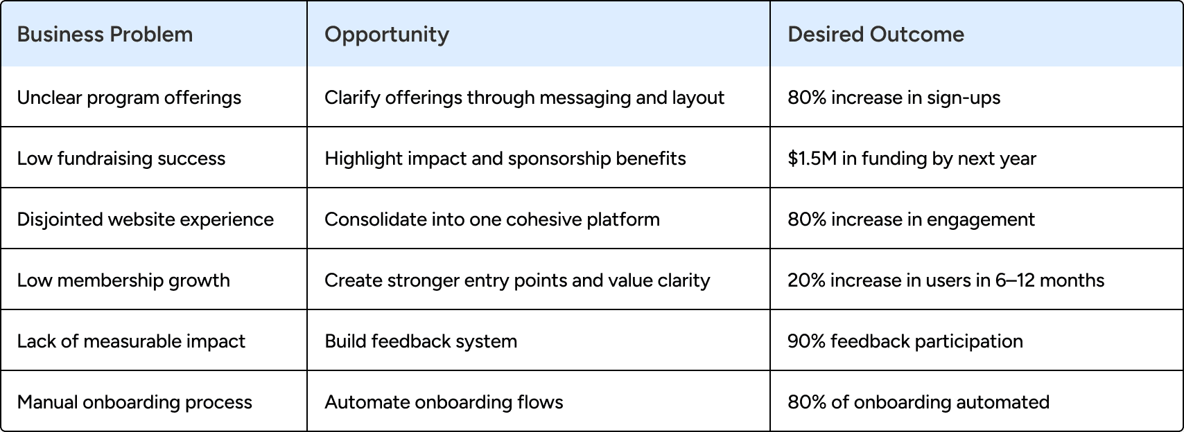
OPPORTUNITY MAPPING
After stakeholder interviews, I translated business pain points into opportunity areas. These informed measurable goals and served as a north star throughout the design process.
COMPETITIVE ANALYSIS
Next, I wanted to see how other organizations were handling similar challenges. I looked at 4 different groups that work with women and professional development.


Competitive analysis takeaways - Website

Competitive analysis takeaways - Dashboard
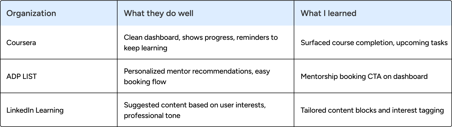
Competitive analysis key takeaways
Every successful organization had clear messaging - no confusion about what they do
Real stories made everything more believable - people trust other people's experiences
Being upfront about offerings helped - transparency made people more likely to sign up
USER INTERVIEWS
I needed to know how people actually find and choose programs like OMG W.O.W.'s, so I interviewed potential users. I asked neutral questions about their behavior - how they discover services, what makes them trust a program, what stops them from signing up
User interview themes
MOTIVATION
MENTORSHIP
COMMUNITY
DECISION FACTORS
LEARNING STYLE
TOOLS
PAIN POINTS
PRIORITIES
LIMITATIONS
User interview insights
Mentorship and trusted advisors play a critical role in decision-making — users value guidance from credible voices to build confidence.
Community is valuable when it feels relevant and credible — people return when information is useful, accurate, and shared by trusted peers
Clarity and credibility drive adoption of new programs — reviews, ratings, and clear purpose help users decide to join.
Flexibility in learning formats increases engagement — users are open to videos, reading, or workshops depending on context.
Tools must adapt to changing needs — people stop using platforms not because of poor design, but when the content is no longer relevant.
Health, spirituality, and balance are top priorities — programs that align with personal growth and well-being resonate most.
JOBS TO BE DONE
I distilled user’s core needs into three actionable jobs.
Learning:
Trusted resources to expand her business knowledge
Mentorship:
Access personalized guidance for growth
Community:
Connect with supportive professionals
USER JOURNEY
Using what I learned about user, I mapped out her entire journey - from first hearing about OMGW.O.W. to becoming an advocate for them.


Ideation
SKETCHING
After taking all the learnings about user and business, I started sketching the membership page first because that's where user's biggest questions needed to be answered:
What exactly do I get from this program?
How much will it cost me?
Why should I trust OMG W.O.W.?


FLOW
Building on the customer journey map, I designed a user flow that integrates user needs, business pain points, and achievable value—resulting in a structure that users can trust and understand more clearly.

WIREFRAMES
I took all my research and turned it into actual wireframes in Figma. I focused on two main pages:
Landing page that immediately shows what OMG W.O.W. is about
Membership page that builds trust and answers all the important questions


TESTING
I tested my prototype with 25 participants using Lysna, which provided valuable insights into how users interacted with the design.

What worked well?
Users clearly understood OMG W.O.W.’s offerings and showed strong interest. The structure made it easy to explore and take next steps.
What I heard?
Participants wanted more visual cues and felt some sections were text-heavy, highlighting the need for better balance.
What I refined?
I reduced text, elevated the sponsorship section, added a member story for connection, and used a dropdown to keep the page focused.


Website Design
COMMUNITY
By highlighting real connection and shared belonging, the Community page reinforces OMG W.O.W.’s promise of a safe, supportive space where members know they’re not alone.

COMMUNICATION
Statements next to each course clarified how purchases support the community, building trust and reinforcing value.


MEMBERSHIP PAGE
The redesigned membership section made each tier clear and celebrated the sliding scale, letting users easily compare benefits and access support.

IMPACT
A number matrix highlighted OMG W.O.W.’s impact, letting users and sponsors see the difference they’re making at a glance.

trust through messaging
Integrated with the membership information, the sponsorship details explain who can become sponsors and what benefits are offered. This transparency encourages confidence and invites mission-driven collaborations.

USER TESTIMONY
Testimonials with member photos highlighted real outcomes, helping potential users see the value through lived experiences.


Dashboard Design
DASHBOARD HOME PAGE
By pulling courses, mentorship, and progress into one view, the dashboard showed why members should keep returning—their growth was visible.
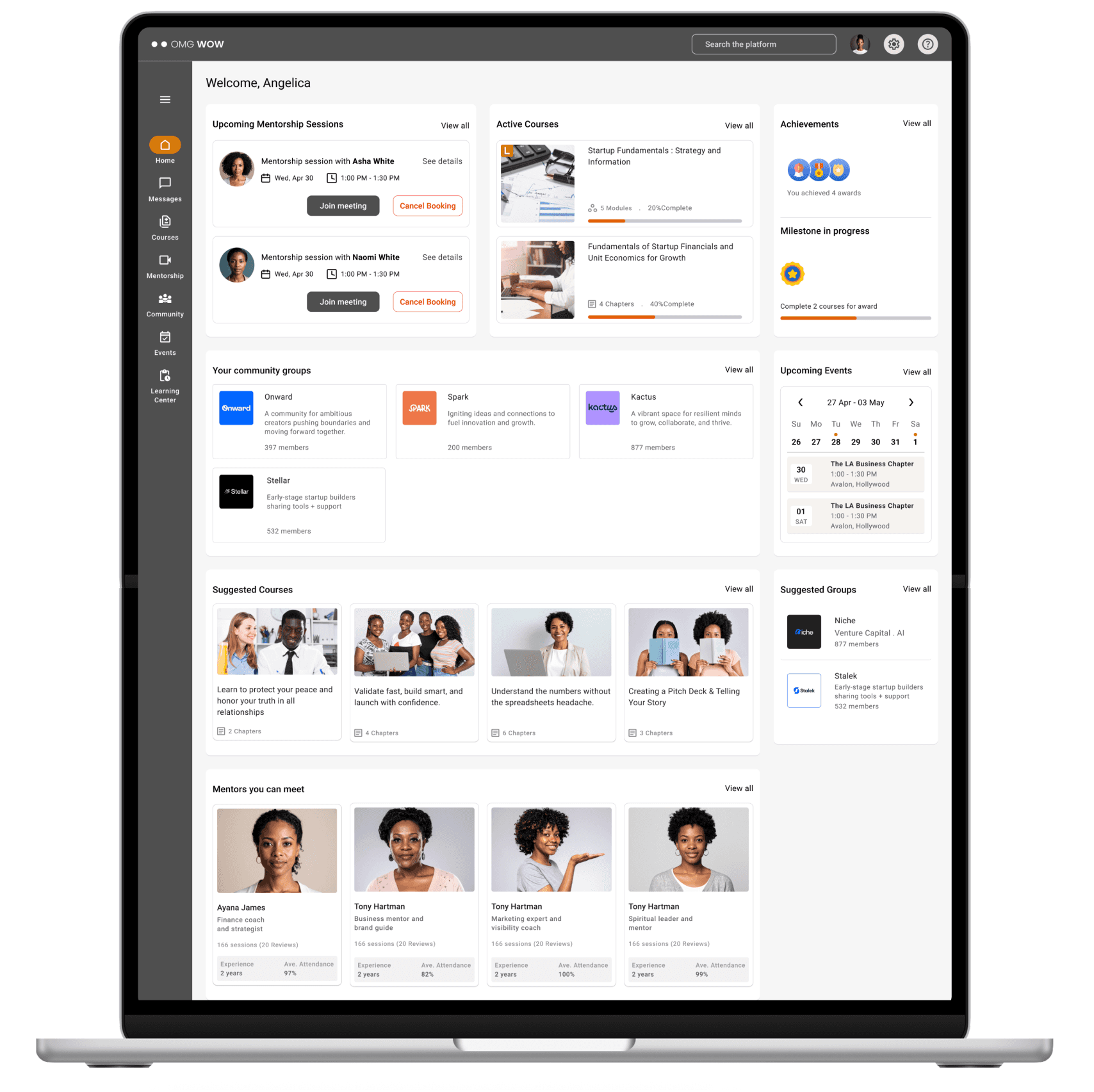
COURSES
Framing courses around personal journeys clarified why learning here matters—it’s not just content, it’s progress tied to each member’s goals.


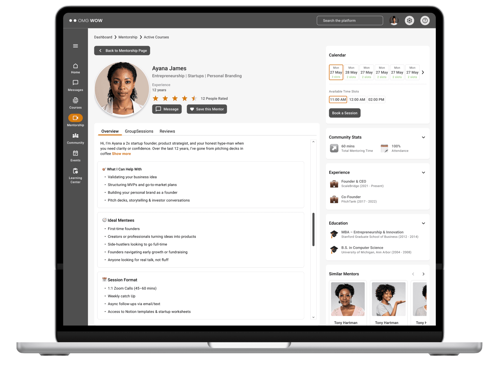
MENTORSHIP
Detailed mentor profiles and booking flows revealed why membership is worth it—choices felt transparent, personal, and actionable.

IMPACT
Simplified navigation and clearer content structure, expected to improve member discovery of programs by ~35–40%.
Centralized digital space for classes, mentorship, and events, projected to increase ongoing engagement by 25–30%.
Clearer pathways to resources, boosting program participation and retention rates by 15–20%.


