Redesigning WOW’s Website for Clarity and Impact
Women Outreaching Women empowers Black women through holistic development programs that address systemic career barriers and foster leadership and wellbeing. Despite its strong mission, the website fell short in clearly communicating its purpose, programs, and impact. This redesign aims to improve clarity, boost membership enrollment, and attract sponsor engagement.
Role
UX-UI Designer
Time
9 Weeks
Team
1 Lead, 3 Designers
Responsibilities
User research , Stakeholder interviews , Taxonomy, Content strategy, Wireframing, High-fidelity UI design
Tools Used

Figma

Firefly

Figjam

Lyssna

Miro

Figma Slides
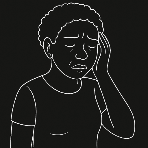
Black women face systemic barriers—limited access to mentorship, trusted networks, and tailored programs that support their personal and professional growth.
Despite being driven and accomplished, many feel isolated on their journey, navigating challenges in business, wellness, career, and community without clear guidance.
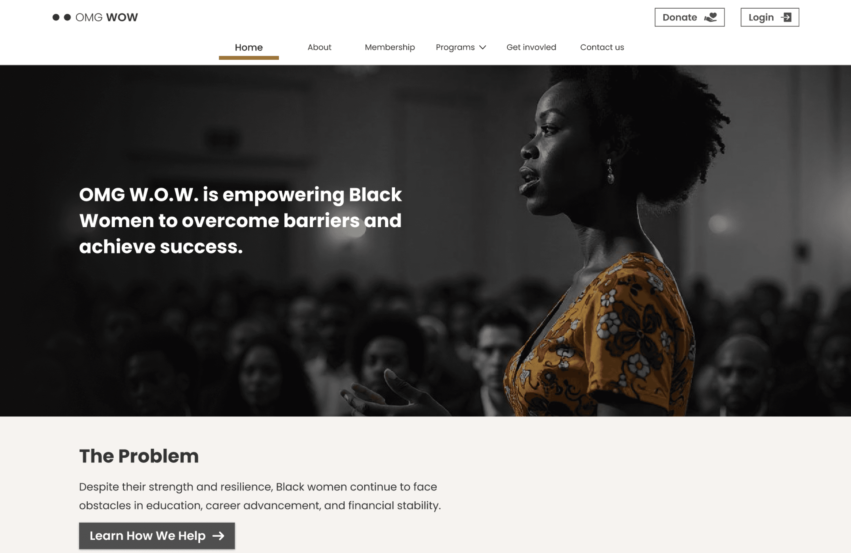
OMG W.O.W. was created to bridge that gap through FRESH, a core program focused on growth in business, finance, relationships, and wellbeing—supported by mentorship and community. But the platform fell short. Its purpose and offerings were unclear, and the message got lost in complexity.
The challenge
How might we design a website that clearly communicates purpose, builds trust, and invites Black women into a community that’s built for them?
The high-level goals that shaped this project
Make offerings transparent and easy to understand
Showcase impact and build credibility through storytelling
Invite users into a trusted, mission-driven space they are proud to join
Strengthen the organization’s appeal to mission-aligned sponsors and partners
The solution
Guiding users from interest to action with clarity and trust
A redesigned website that turns confusion into confident sign-ups with clear messaging, transparent offerings, and trust-building content — while strengthening the mission’s appeal to sponsors and partners.

Clarity in offering
Testimonials with member photos highlighted real outcomes, helping potential users see the value through lived experiences.
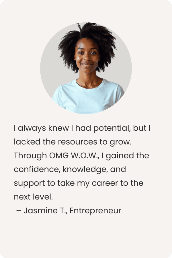

Reinforcing credibility through community voices
Testimonials with member photos highlighted real outcomes, helping potential users see the value through lived experiences.
Building trust through messaging
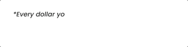
To align course pricing with OMG W.O.W.’s mission, a short impact statement was placed next to each course. This addition clarified how purchases support the broader community, helping build trust and reinforcing the value behind the offering.


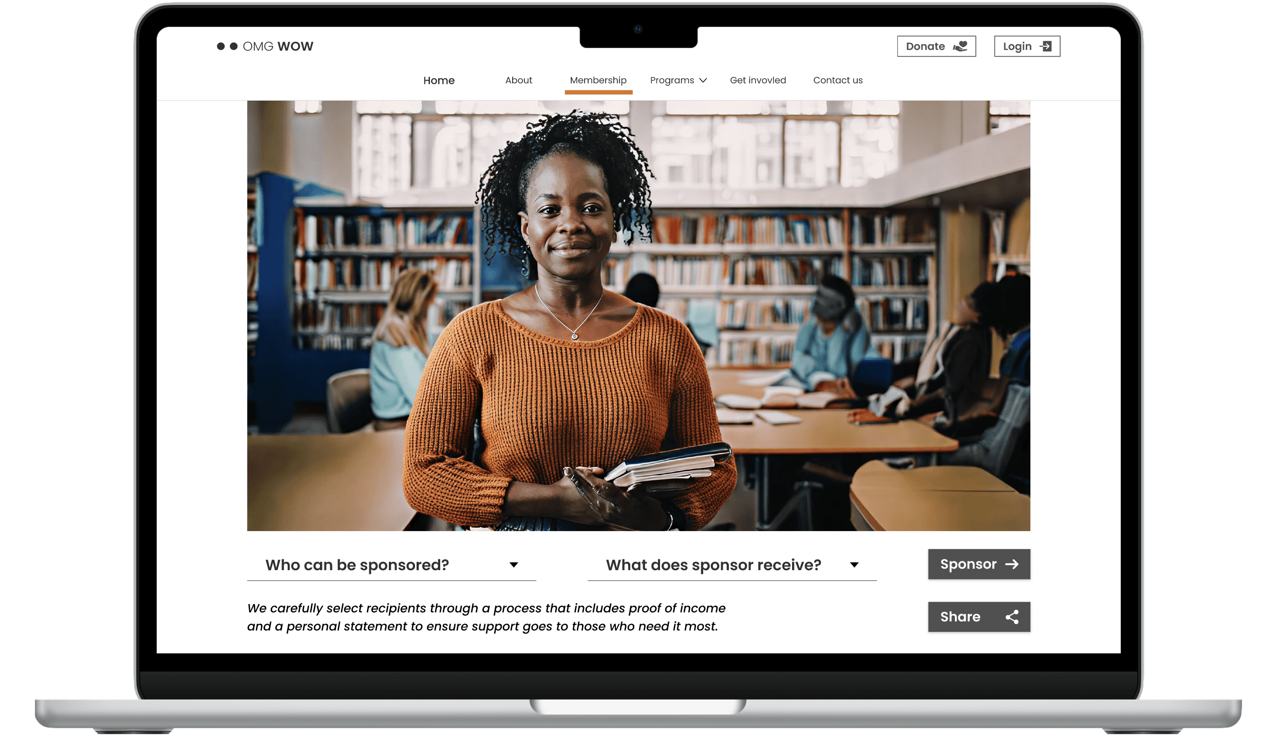
Making membership easy to understand and join
The redesigned membership section clearly defined each tier and placed special focus on the sliding scale option, making it easy for users to understand their choices, compare benefits, and apply for financial support directly on the page.
Defining sponsorship and its benefits
Integrated with the membership information, the sponsorship details explain who can become sponsors and what benefits are offered. This transparency encourages confidence and invites mission-driven collaborations.
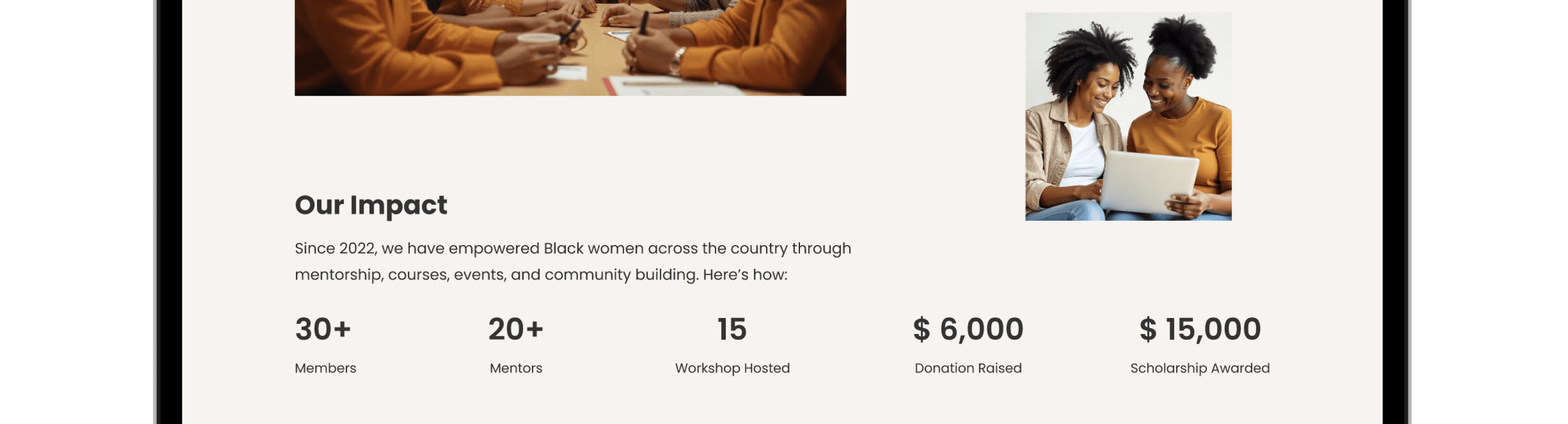
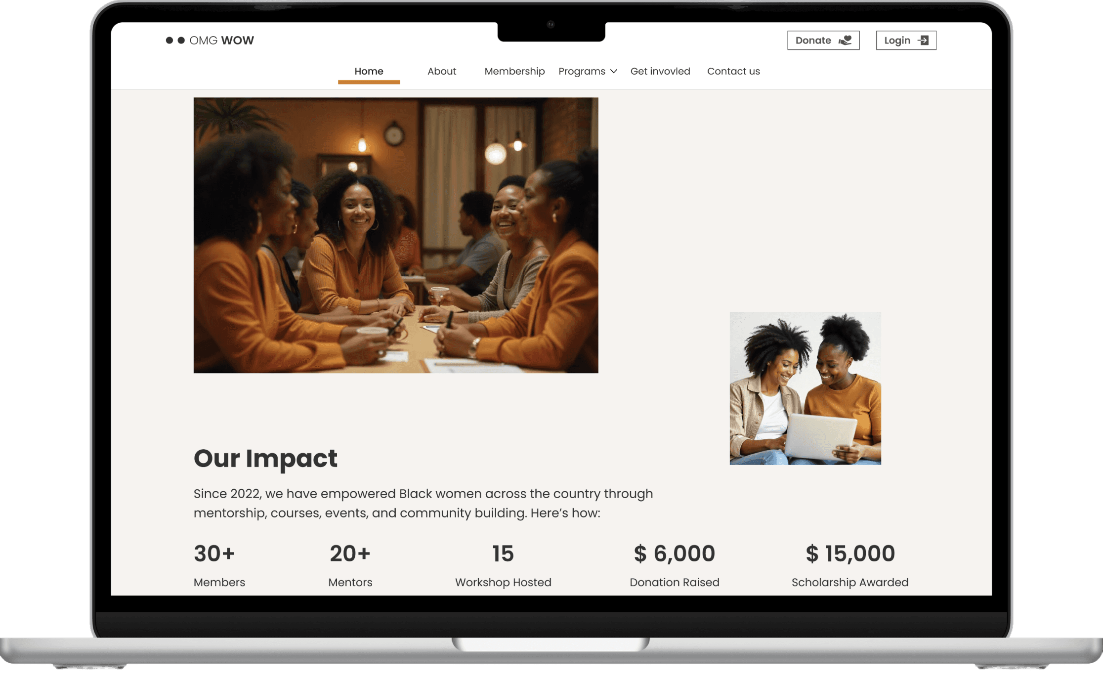
Highlighting impact through data
A number matrix was added to showcase the organization’s reach and progress, giving users and sponsors a clear, at-a-glance view of the difference OMG W.O.W. is making.
OMG W.O.W. creates pathways for confident enrollment, community connection, and growth focused on empowering Black women.
See below the process of how this was achieved.
research
Understanding the Problem
I began by reviewing their Instagram, LinkedIn, website, and client-provided data. It quickly became clear that key messages was not clear. I identified 10 recurring themes of unclear or missing information, which shaped the questions I later asked stakeholders.
Talking to the Stakeholders
Through in-depth stakeholder interviews, I uncovered the root causes behind the business challenges. After synthesizing the insights, I grouped the problems into primary and secondary categories.
Primary Problems
Users don’t understand what OMG W.O.W. actually does.
We're struggling to attract sponsors and donors.
Secondary Problems
We need better ways to collect user feedback.
Our two separate websites create a confusing experience.
Manual onboarding slows everything down.
Our user growth has stalled - people visit but don't join.
"We have very, very little support in fundraising.”
-Stakeholder
"Users don't know what they're gonna get. They don't know how much it's gonna cost to get it."
-Stakeholder
The primary problems focused on the core issue. If users do not understand what OMG W.O.W. offers, they will not engage, and potential sponsors will not see the value in supporting it. Establishing clarity around the organization's purpose and programs became the foundation for all design decisions that followed.
Turning pain points into opportunities
After stakeholder interviews, I translated business pain points into opportunity areas. These informed measurable goals and served as a north star throughout the design process.

Learning from Similar Organizations
Next, I wanted to see how other organizations were handling similar challenges. I looked at 4 different groups that work with women and professional development.

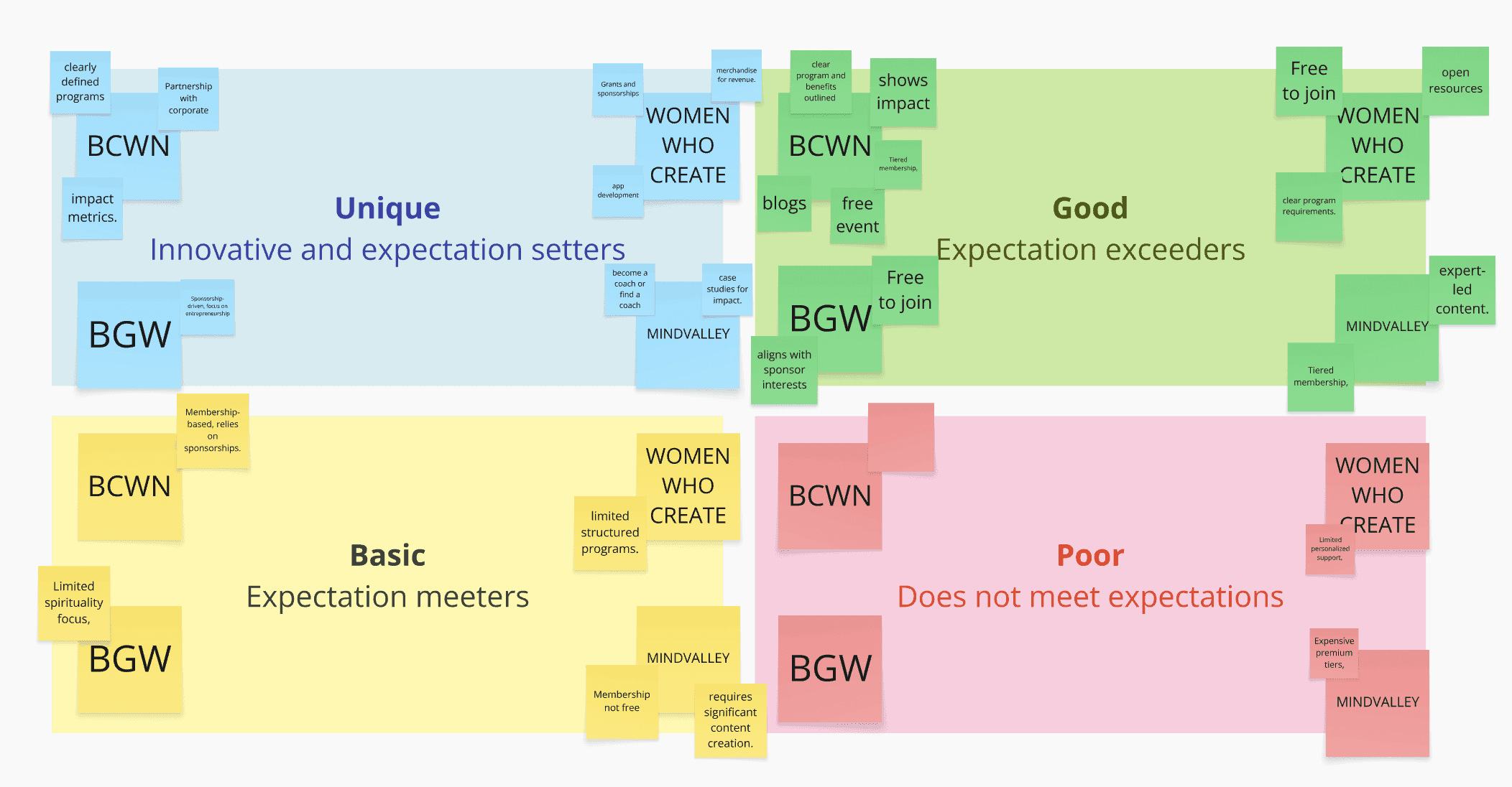

What I Learned from this competitive analysis
Every successful organization had crystal-clear messaging - no confusion about what they do
Real member stories made everything more believable - people trust other people's experiences
Being upfront about details and costs actually helped - transparency made people more likely to sign up
Understanding the Users
I needed to know how people actually find and choose programs like OMG W.O.W.'s, so I interviewed potential users. I asked neutral questions about their behavior - how they discover services, what makes them trust a program, what stops them from signing up.

Angelic William
Age
38
Education
Masters in Business
Status
Divorced, Mother of 2
Occupation
Director of HR
Location
New York
Tech literate
High
I appreciate communities that provide accurate, useful information and foster meaningful interactions.
Mentorship is incredibly valuable. It helps me see things from different angles and avoid feeling isolated."
Goals
Angelique, a tech-savvy talent acquisition expert, is dedicated to social impact and workforce development. A divorced mother of two, she balances work, growth, and well-being while enjoying reading, walking, and travel.
Motivation
Diversify Learning: Expand her knowledge and skills in areas like business, finance, and personal development.
Improve Health and Spirituality: Maintain a healthy lifestyle and deepen her spiritual practices.
Build a Support Network: Connect with a community of women who uplift and empower each other.
Improve Relationship : Manage her career, parenting, and personal growth without feeling overwhelmed.
Jobs-to-Be-Done Framework
I distilled Angelicas's core needs into three actionable jobs
Learning: Trusted resources to expand her business knowledge
Mentorship: Access personalized guidance for growth
Community: Connect with supportive professionals
Mapping Out the User Journey
Using what I learned about Angelica, I mapped out her entire journey - from first hearing about OMGbW.O.W. to hopefully becoming an advocate for them.

DESIGN
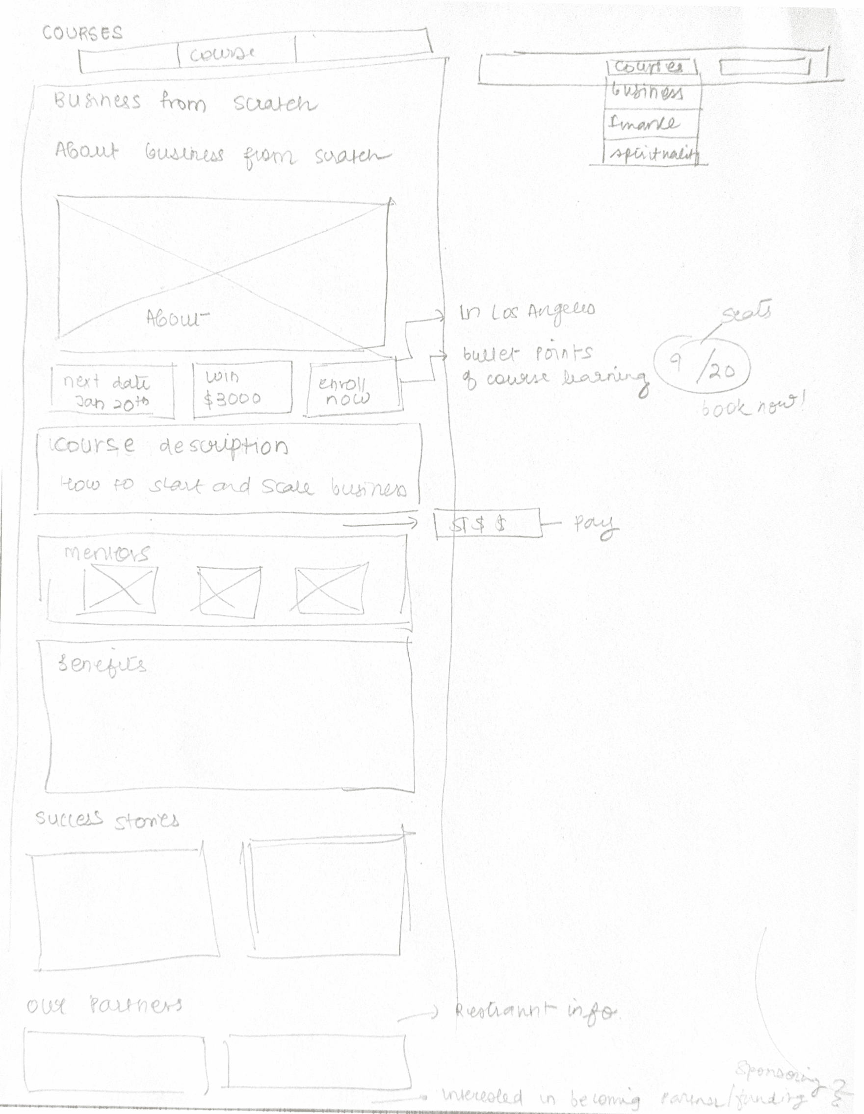
Starting solution with sketches
After taking all the learnings about user and business, I started sketching the membership page first because that's where Angelique's biggest questions needed to be answered:
What exactly do I get from this program?
How much will it cost me?
Why should I trust OMG W.O.W.?


Creating the User Flow
I created a comprehensive user flow for the website, with special attention to the membership and landing pages. The new structure addressed the two biggest issues: confusion around what OMG WOW offers and lack of clarity about membership benefits. It also resolved the disjointed experience across two platforms, resulting in one cohesive, user-centered journey that aligned with both user needs and business goals.

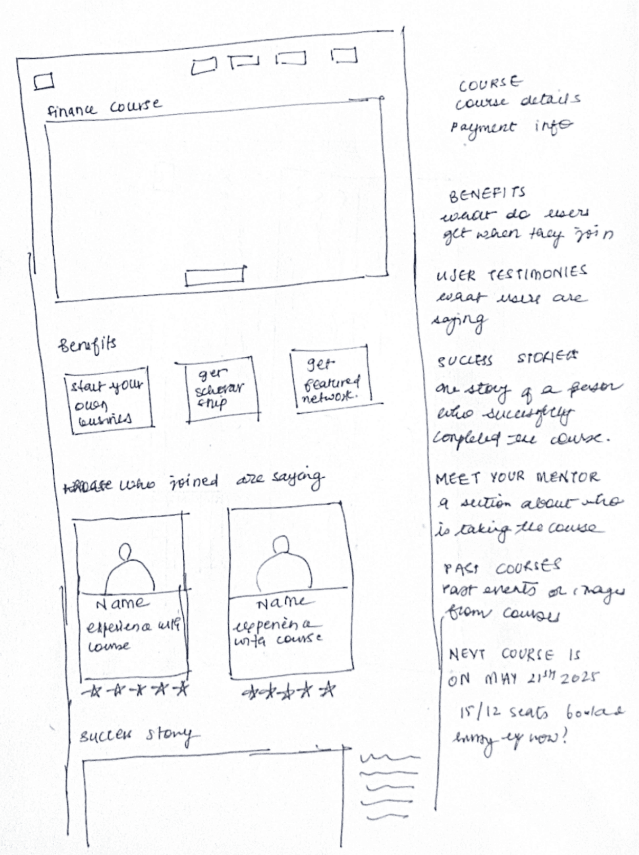
Building Wirefrmaes
I took all my research and turned it into actual wireframes in Figma. I focused on two main pages:
Membership page that builds trust and answers all the important questions
Landing page that immediately shows what OMG W.O.W. is about

Validating the Design with Users
I tested my prototype with 25 people using Lysna. This was super helpful because I could see exactlyhow people were interacting with the design

A/B Testing
A/B testing helped confirm that leading with membership plans made it easier for users to understand their options and take action quickly. Followed by the F.R.E.S.H. pillars, this order gave just enough context without overwhelming them. Reducing visual clutter, adding a real member story, and improving the sponsorship section all worked together to build trust. FAQs at the end helped address common concerns and support decision-making. Overall, these changes made the page more focused, clear, and motivating.


The Final Prototype
Click to interact with the prototype.
Press R to reset
Project Outcomes & Learnings
What worked really well
Starting with deep research gave me a strong foundation, and iterating along the way helped refine the design. Focusing on Angelica's specific needs kept me from getting distracted by nice-to-haves. Looking at competitors also helped me understand what actually works in this space.
things I'd do differently next time
I would have done more accessibility testing to ensure the site works for everyone, and followed up with interviews after users interacted with the prototype to gather deeper insights.
The Impact
While I don't have metrics yet, feedback during the process showed this was headed in the right direction. The stakeholder felt the design finally represented who they really are. The clear program structure made it easier for them to explain their offerings, and they felt more confident about fundraising.
What's Next
This project focused on redesigning the public-facing website. A member dashboard is currently in progress to support engagement beyond sign-up and create a seamless, mission-aligned experience for long-term growth.
